Top Kitchen Cabinet Color TrendsYou’ll Want to Copy— 2026 Edition —
Sage. Espresso. Inky navy. Buttery yellow. 2026 is the year the all-white kitchen finally quietly retires — and warm, soulful, color-soaked cabinets take its place. Here are the 9 shades dominating Pinterest mood boards right now.
📌 Pin this for your next renovation board
The all-white kitchen is officially over 🪦
It served us for a solid decade. But in 2026, the trend has fully shifted toward warm, lived-in, color-confident kitchens that feel like rooms you actually want to hang out in.
Three things drove the shift: people are cooking at home more than any time in the last 30 years, that “quiet luxury” aesthetic that took over fashion is now hitting interiors hard, and Pinterest searches for “warm kitchen” jumped 340% in the last 12 months alone.
The result? Cabinet colors that feel more like furniture than appliances. Less hospital, more home.
Warm tones win
Every trending 2026 cabinet color has warm undertones. Even the cool ones (navy, forest green) are deeper and richer than 2023’s icy palette.
Natural wood is back
Painted cabinets are everywhere — but so is visible oak grain, walnut, and rift-cut wood. Often paired with color on the lower cabinets.
Brass hardware = standard
Polished chrome and brushed nickel are out. Unlacquered brass, antique gold, and aged bronze are the new standard finishes.
Two-tone is everywhere
Upper cabinets in one color, lower (or island) in another. The most-pinned format on Pinterest for 2026 kitchen renos.
Matte over gloss
Velvet matte and eggshell finishes are dominating. They hide fingerprints, soften lighting, and feel infinitely more high-end than gloss.
Slab fronts vs shaker
Shaker is still safe. But plain slab fronts in deep colors are the modern move — clean, sculptural, very European.
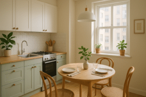
1. Sage Green — The Queen of 2026
Calm, herby, expensive-looking. The “in case of doubt, paint it sage” color.
🎨 Best paired with
- Counters: creamy quartz, warm white marble, butcher block
- Backsplash: zellige tile in cream or oat, vertical subway in muted white
- Hardware: unlacquered brass (the perfect match), antique gold
- Flooring: light oak, terracotta tile, wide-plank natural wood
- Walls: warm cream, soft mushroom, or matched in a slightly lighter sage
🏡 Style match
- Modern English country
- Quiet luxury / Scandinavian-Japandi crossover
- Transitional with a soft modern edge
2. Deep Forest Green — Moody & Dramatic
For people who want their kitchen to feel like an English library.
🎨 Best paired with
- Counters: white marble with grey veining, cream quartz with depth
- Backsplash: classic white subway tile, marble slab, or full-height matching slab
- Hardware: unlacquered brass (essential — chrome looks wrong)
- Flooring: light oak (to balance), terracotta, or wide herringbone
- Walls: bright white, soft cream, or matching forest on lower half
🏡 Style match
- English manor / library kitchen
- Maximalist with art and books
- Classic-traditional with modern hardware
3. Warm Clay & Terracotta — Earthy Magic
Mediterranean villa vibes — sunshine in cabinet form.
🎨 Best paired with
- Counters: cream quartz, butcher block, or honed limestone
- Backsplash: handmade zellige in cream or natural, terracotta hex tile
- Hardware: aged brass, oil-rubbed bronze, leather pulls
- Flooring: terracotta saltillo tile, warm oak, natural stone
- Walls: soft cream, warm beige, plaster-finish off-white
🏡 Style match
- Mediterranean (Spanish, Italian, Provençal)
- Southwestern / desert modern
- Eclectic boho with vintage finds
4. Bone & Warm Cream — The New “White”
Soft, warm, forgiving. The smartest neutral move of 2026.
🎨 Best paired with
- Counters: literally anything — warm marble, soapstone, dark quartz
- Backsplash: zellige, brick (white-washed or natural), patterned cement tile
- Hardware: brass for warmth, bronze for grounding, black for contrast
- Flooring: oak, walnut, terracotta, herringbone — all work
- Walls: matched in same warm cream, or in a darker accent for contrast
🏡 Style match
- Modern farmhouse without the rustic overload
- Quiet luxury / Scandinavian
- Classic-transitional that won’t date
6. Espresso & Chocolate Brown — The Comeback
Yes, brown is back. And it looks unreal with brass.
🎨 Best paired with
- Counters: cream quartz, white marble with warm veining, butcher block
- Backsplash: cream zellige, brick, or cream-toned natural stone
- Hardware: antique brass, aged bronze, leather pulls
- Flooring: terracotta tile, lighter oak (to balance), warm wide-plank
- Walls: warm cream, soft white plaster, or matched chocolate on lower portion
🏡 Style match
- Rustic luxe / refined rustic
- 70s revival (done sophisticated, not kitschy)
- Mediterranean with cream and brass
7. Burgundy & Cherry Red — Bold Move
The high-fashion color of 2026, finally bleeding into interiors.
🎨 Best paired with
- Counters: cream marble or quartz (the contrast is everything)
- Backsplash: classic white subway, cream zellige, or full-height cream slab
- Hardware: polished brass, brushed gold (chrome would kill it)
- Flooring: light oak, herringbone wood, cream tile
- Walls: bright cream — burgundy needs lightness around it to not feel oppressive
🏡 Style match
- French bistro / brasserie-inspired
- Maximalist with vintage finds
- Bold modern with one statement color
8. Butter Yellow — Cottagecore Renaissance
Soft, sunny, slightly granny — and weirdly chic right now.
🎨 Best paired with
- Counters: cream quartz, butcher block, or warm marble
- Backsplash: hand-painted Delft tile, cream zellige, or vintage-look subway
- Hardware: antique brass, polished gold, ceramic knobs
- Flooring: terracotta tile, warm oak, painted wide-plank
- Walls: bright cream, soft white, or a contrasting soft sage
🏡 Style match
- Cottagecore / English country cottage
- Provençal French country
- Granny chic / refined vintage
9. Two-Tone — The Designer Flex
Two colors, one kitchen, infinite combinations. The most-pinned format of 2026.
🎨 The 5 winning combos for 2026
- Bone upper + Sage lower: classic, easy, designer-approved
- Cream upper + Navy island: the safest “wow” move
- Forest green lower + White upper: dramatic but balanced
- Bone upper + Burgundy island: for the high-commitment crowd
- Natural wood upper + Clay lower: warm + earthy + modern
🏡 Style match
- Custom designer-feel without the designer price
- Works in modern, transitional, and traditional styles
- Hides awkward room proportions by splitting the visual weight
The pairing cheat sheet 🔨
The right counter + hardware combo can make a budget cabinet look custom. The wrong one makes a $40k kitchen look cheap. Here’s the safest match for each color.
Pick by kitchen size 📏
The color that looks divine in a 200 sq ft kitchen will turn a 60 sq ft galley into a closet. Pick accordingly.
Small kitchen (under 80 sq ft)
Lean light and warm to keep the space feeling open. Avoid full-dark cabinets — they’ll close the room in. If you love dark, do it as a two-tone with lower cabs only.
✅ Best picks: Bone, Sage, Butter YellowMedium kitchen (80–150 sq ft)
You have flexibility. Most cabinet colors will work, especially if you have at least one window. Two-tone shines at this size — bone upper + sage lower is foolproof.
✅ Best picks: Any color, two-tone shinesLarge kitchen (150+ sq ft)
This is where moody colors live their best lives. Forest green, espresso, navy, burgundy — all look incredible. Pair with cream walls and brass to keep it grounded and bright where it matters.
✅ Best picks: Forest, Espresso, Navy, BurgundyPick by natural light 🌞
The direction your windows face changes everything about how a paint color reads. Most people skip this step and regret it.
North-facing (cool, soft light)
Light feels cooler and grayer here. Lean warm — cool colors like icy navy or grey-green will read flat and dreary. Warm tones bring life back.
✅ Best: Bone, Clay, Espresso, Warm SageSouth-facing (warm, bright)
You have the most flexibility. Strong colors don’t get washed out, and cooler tones look balanced rather than gloomy. Show-off lighting.
✅ Best: Any color works beautifullyEast-facing (bright AM, dim PM)
Cabinets read warm in the morning, cool in the evening. Pick something that handles both — neutral-warm shades like sage, bone, or honeyed wood.
✅ Best: Sage, Bone, Two-toneWest-facing (golden PM light)
Warm afternoon light deepens everything. Cool colors look balanced here, warm colors can go overripe. Navy, forest, and grey-green look incredible.
✅ Best: Navy, Forest, SageMistakes that ruin a cabinet color 🚫
If your finished kitchen looks “off” even though the color seemed right, it’s almost always one of these.
❌ Choosing color from a tiny chip
2″x2″ swatches lie. Always buy a sample pot and paint a 2-foot square. Color changes dramatically at scale.
❌ Ignoring undertones
Two sages can have completely different undertones (one cool/blue, one warm/yellow). They will not pair the same with your floor or counter. Check undertones against your existing finishes.
❌ Picking high-gloss finish
Gloss shows every fingerprint and reflects harsh overhead light. Eggshell or satin looks more expensive and hides daily wear far better.
❌ Not updating the hardware
Painting cabinets but keeping 2014 brushed-nickel handles = instantly looks like a half-renovation. Hardware is 15% of cost, 50% of the upgrade.
❌ Going too matchy
Cabinets in sage + walls in sage + curtains in sage = sad mood room. Pick one color to lead, support with neutrals and contrast.
❌ Skipping the prep work
Painting unsanded, ungreased cabinets = chipped, peeling kitchen in 6 months. Prep is 80% of the result, no matter how nice the paint is.
Cabinet color questions you’ve been Googling 💬
Every question Pinterest comments keep asking. Tap to expand.
Sage has been trending for 3+ years already and shows no signs of fading — design pros generally consider warm muted greens to be in the same “timeless neutral” category as navy and cream. The wildly trendy version (super saturated bright green) may date faster, but a soft, muted, almost-grey sage will likely stay in the rotation for 10+ years. It’s basically the new beige.
Painting is dramatically cheaper. A professional cabinet refinishing job typically runs $1,500–$4,000 depending on kitchen size, while new mid-range cabinets start around $8,000–$15,000 and can easily hit $30k+. DIY painting brings it down to about $200–$500 in materials. If your cabinet boxes are solid wood and in good shape, paint them. Only replace if they’re particle board falling apart, or you want to change the layout.
Satin or eggshell is the sweet spot for 2026. Matte feels luxurious but is hard to clean — fingerprints and grease show easily and can stain. Gloss is too shiny, shows every imperfection, and reads as builder-grade. Satin (or eggshell, which is slightly less shiny) gives you a soft, modern look that wipes clean. This is the finish most designers spec for kitchens.
Bone / warm cream is the most consistently in-style cabinet color of the last 50 years and shows no signs of dating. Pure stark white is starting to feel cold and dated, but soft warm whites (think creamy oat, mushroom, bone) are quietly going to outlast every trend. If you’re worried about resale or commitment, this is the safest bet.
Yes — this is genuinely the most-pinned move of 2026. A two-tone setup with a different-colored island makes a kitchen feel custom and designer-built, even with stock cabinets. Safe combos: cream perimeter + navy island, white perimeter + sage island, bone perimeter + espresso island. The contrast adds visual interest and makes the island feel like a piece of furniture rather than just storage.
A properly prepped and painted cabinet job — meaning sanded, cleaned, primed, and painted with cabinet-specific paint — lasts 8–12 years before needing a touch-up or refresh. If you skip prep (no sanding, no primer), expect chips, peeling, and dings within 6–12 months. The paint isn’t the problem — the prep is. Always degloss, prime, and use cabinet-grade enamel (Benjamin Moore Advance, Sherwin-Williams Emerald Urethane, or Behr Cabinet & Trim Enamel).
You can absolutely DIY, but it takes way longer than YouTube makes it look. Expect 5–7 full days for a medium kitchen if you do it right (remove doors, label, sand, clean, prime, paint 2–3 coats with dry time between). Common DIY failures: skipping primer, painting over grease, using wall paint instead of cabinet enamel, rushing dry time. If your kitchen is your only kitchen and you can’t take it offline for a week, hire a pro. Otherwise, DIY is a real money-saver.
Unlacquered brass is the universal 2026 winner — it pairs beautifully with every color on this list and develops a gorgeous lived-in patina over time. Aged brass and antique gold are similarly versatile. Avoid: polished chrome (feels 2015), brushed nickel (feels builder-grade), and matte black on light cabinets (can read harsh). If you want one safe pick, get unlacquered brass and you can’t go wrong.
Yes — but not how you’d think. Warm neutral cabinet colors (bone, soft sage, very pale grey) have been shown to boost or maintain resale value. Bold or polarizing colors like burgundy, butter yellow, or full forest green can either thrill buyers or scare them off — it’s a 50/50 split. If you’re selling in the next 2 years, go neutral. If this is your forever home, paint whatever makes you happy. The “neutralize before listing” stage is what realtors recommend.
The three pros consistently recommend: Benjamin Moore Advance (water-based alkyd, self-leveling, beautiful finish), Sherwin-Williams Emerald Urethane (insanely durable, slightly tricky to apply), and Behr Cabinet & Trim Enamel (more budget-friendly, widely available). Avoid: regular wall paint, even premium versions — it’s not built for cabinet wear and tear. Spend the extra $20 per gallon on a real cabinet-grade enamel. It pays back in years of longevity.
Your kitchen, but make it 2026 🎨
Save this for the next “what color should I paint the cabinets” spiral — and send it to the friend who’s been saying “I’m finally redoing the kitchen” for three years. 💌