Best Floor Colors for Espresso Cabinets
Twelve floor colors that make dark espresso cabinets look intentional instead of heavy, ranked by how well they balance the room, plus the undertone rule that keeps beige from turning pink.
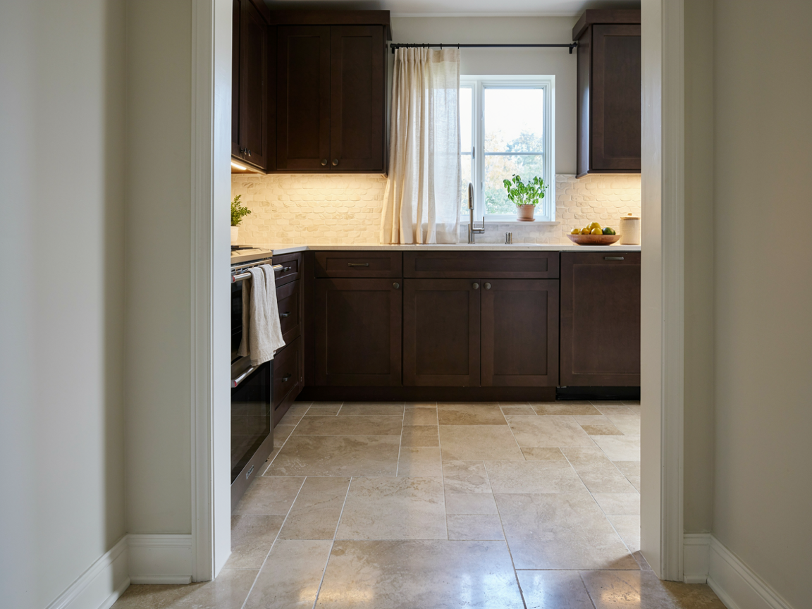
The best floor colors for espresso cabinets are light and warm: natural white oak, whitewashed or blonde wood, honey maple, warm greige vinyl plank and creamy beige tile.
Espresso is a near-black brown with a red undertone. The floor’s job is to bounce light back up into the room so the cabinets don’t swallow it.
- Light-to-medium warm floors do that job.
- Dark, cool or pink-beige floors fight it.
Pick a floor at least three shades lighter than the cabinets, with a warm (yellow or golden) undertone. Natural white oak is the safest choice; warm greige plank is the most forgiving in a busy kitchen; creamy beige porcelain tile is the winner if the kitchen sees spills and dogs. Save dark walnut and charcoal for large, sun-filled kitchens only.
Floor Color Chart for Espresso Cabinets
Use this chart to match the floor to the look you want. “Contrast” is how far the floor sits from the cabinets in lightness; high contrast opens a room up, low contrast makes it moodier.
| Floor color | Contrast | Look it creates | Best for |
|---|---|---|---|
| Natural white oak | High | Timeless, warm, transitional | Almost any kitchen; the default pick |
| Whitewashed / bleached oak | Very high | Coastal, Scandinavian, airy | Small or north-facing kitchens |
| Honey / blonde maple | High | Cozy, golden, classic | Kitchens with warm counters and brass |
| Warm greige plank | Medium-high | Modern, calm, hides dust | Busy family kitchens, open plans |
| Light warm gray | Medium-high | Contemporary, cool-modern | Kitchens with white or gray quartz |
| Creamy beige / travertine tile | High | Mediterranean, soft, forgiving | Spill-heavy kitchens, hot climates |
| Cream large-format tile | Very high | Clean, bright, spacious | Dark kitchens needing maximum light |
| Terracotta / warm clay | Medium | Rustic, Spanish, earthy | Farmhouse and sun-filled rooms |
| Medium hickory / caramel | Medium | Rich, layered, traditional | Large kitchens with lots of daylight |
| Sand / driftwood | High | Relaxed, beachy, matte | Casual open-plan homes |
| Black & white checkerboard | Mixed | Vintage, bold, graphic | Statement kitchens, butler’s pantries |
| Dark walnut (with caveats) | Low | Moody, luxe, tone-on-tone | Big, bright kitchens with pale counters only |
Swatches are approximations; always test a real sample next to your cabinet door in daylight and under your kitchen lights.
The 12 Best Floor Colors for Espresso Cabinets, Ranked
Ranked from the safest, most versatile pairing to the boldest. The first six suit nearly every kitchen; the last six are style choices that need the right room.
Natural White Oak
Pale, straw-colored, lightly grained. The classic dark-over-light pairing that never dates.
- Undertone: soft yellow, sits next to espresso’s red-brown without going orange
- Finish: matte, so the floor never looks plasticky under dark doors
- Resale: the floor buyers expect to see
Whitewashed or Bleached Oak
A step lighter than natural oak, chalky and almost white, grain still visible.
- Contrast: the highest you can get from a wood floor
- Effect: a small or north-facing kitchen feels twice as bright
- Rule: keep counters light too so the cabinets are the only dark element
Honey or Blonde Maple
Golden and smooth-grained. Leans into espresso’s warmth instead of cooling it.
- Reads as: cozy, traditional, craftsman
- Pairs with: cream counters, brass or bronze pulls
- Avoid: orange-stained maple; golden yes, orange no
Warm Greige Vinyl Plank
Gray with enough beige to stay warm. In luxury vinyl plank, the hardest-working floor here.
- Hides: crumbs, dust, dog hair
- Handles: water, kids, heavy traffic
- Test: greige should lean tan, not lilac; hold it beside the door
Light Warm Gray
A pale gray floor turns espresso cabinets contemporary. The key word is warm.
- Works: gray with a hint of taupe
- Fails: blue-gray, which makes espresso look muddy
- Pair with: white quartz and a white backsplash to stay crisp
Creamy Beige or Travertine-Look Tile
Soft beige porcelain or honed travertine. The light-floor lift of oak with none of the water worries.
- Why: echoes espresso’s warmth while staying 3–4 shades lighter
- Finish: matte or honed; gloss shows every footprint
- Bonus: you can mop it hard
Cream Large-Format Tile
Big 24×48-inch cream tiles with minimal grout read as one pale plane.
- Result: the most light you can reflect back at dark cabinets
- Grout: match it to the tile so the grid disappears
- Warm it up: a wood island or stools keep it from feeling clinical
Terracotta or Warm Clay
Shares espresso’s red undertone, so the two feel related rather than contrasted.
- Style: Mediterranean, Spanish, farmhouse
- Why it works: saturated but still much lighter than the cabinets
- Balance: plaster-white walls and a pale counter so red doesn’t take over
Medium Hickory or Caramel Oak
A mid-tone floor with visible grain variation. Rich, layered, traditional.
- Risk: the room reads all-brown
- Fix: pale counter, light backsplash, lots of daylight
- Pick: wide planks with color variation, not a flat caramel stain
Sand or Driftwood
Matte, muted, slightly weathered. Relaxed and beachy against espresso.
- Compared to greige: lighter, more visible texture
- Softens: the crisp lines of shaker doors
- Watch: some driftwood finishes go green in warm light
Black and White Checkerboard
White squares supply the light; black squares tie into the cabinets.
- Tones: warm off-white and charcoal, not pure white and jet black
- Size: 12-inch squares feel classic; 8-inch feels busy in a small room
- Best when: the floor is meant to be the feature
Dark Walnut (Tone-on-Tone)
Dark floor, dark cabinets. Stunning in the right room, a cave in the wrong one.
- Needs: a big kitchen, tall windows, pale counters and walls
- Pick: a walnut a few shades lighter than the cabinets, matte
- Never: match the two exactly; it reads like a mistake
The Undertone Rule That Makes or Breaks the Pairing
Most floor-and-cabinet mismatches are not about light versus dark. They are about undertone.
Espresso is a warm color. Under bright light you will see chocolate and a hint of deep red. A floor whose hidden undertone clashes with that red looks wrong even when the lightness is perfect.
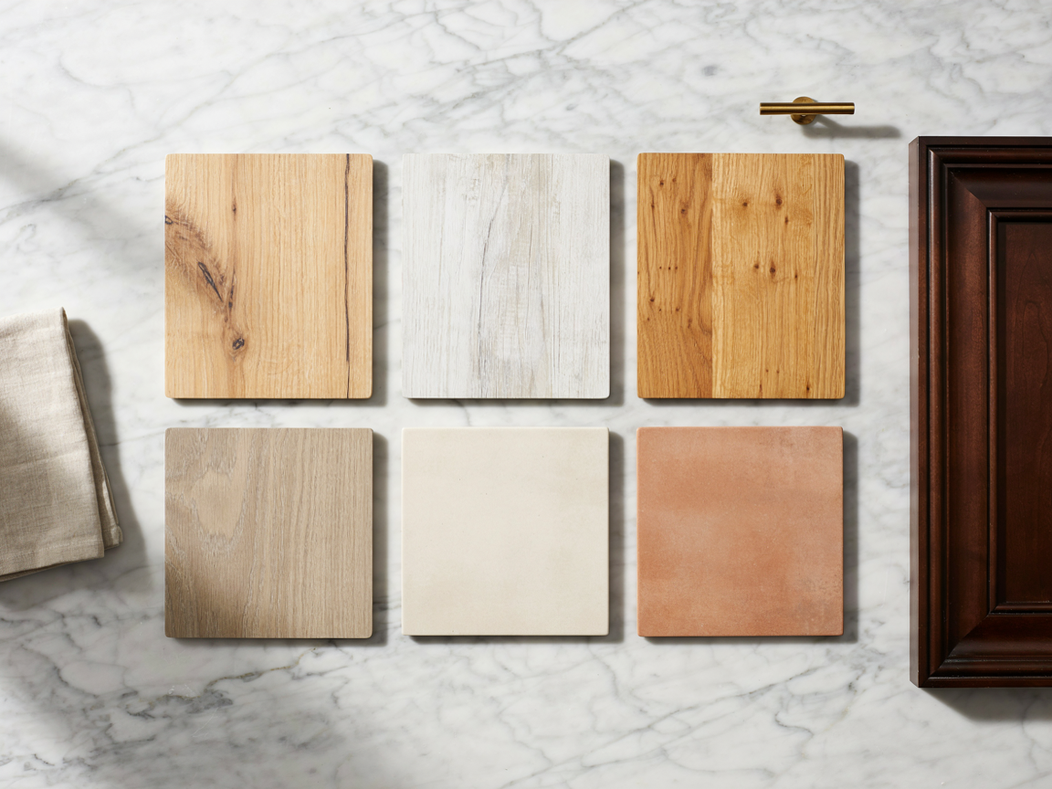
Lay the sample on a sheet of plain white printer paper in daylight. Whatever color “leaks” out of the sample against the white is the undertone: yellow, orange, pink, green or blue. Yellow and golden undertones are safe with espresso. Pink, green and blue undertones are not.
Yellow-beige & golden
Natural oak, honey maple, warm sand, most travertine looks. These share espresso’s warmth and look like they were chosen together.
Warm greige & taupe
Gray with a tan base. The most modern-looking safe option, and it hides dirt. Check for lilac before buying.
Pink-beige
The classic mistake. Many “beige” tiles and carpets have a pink base that turns salmon next to espresso’s red. Test on white paper.
Blue-gray & green-gray
Cool grays make espresso look muddy and the room feel cold. If you want gray, keep it warm and light.
Orange-red stains
Cherry, red oak with an orange stain, or “gunstock” finishes double up on espresso’s red and the kitchen goes brassy.
Pure white
Very high contrast, very clean, but stark white can make espresso look black. Off-white or ivory is friendlier.
Warm. Espresso is a very dark brown, not a black, and its undertone is red-brown. That is why it pairs so well with brass, cream, gold and warm woods, and why cool blue-grays tend to fight it. If your cabinets look almost black in the room, add warmer bulbs (2700K) and a warm floor and the brown comes back.
Best Flooring Material for Espresso Cabinets, by Color
The color rules above apply to every material, but each material handles a kitchen differently. Here is where each one shines with dark cabinets.
Solid white oak, matte finish
The gold standard. Choose a low-sheen water-based finish; high gloss under dark cabinets looks dated. Wide planks (6 to 8 inches) feel current. Wipe spills quickly and protect it at the sink.
Same look, more stable
A real oak wear layer over a plywood core handles kitchen humidity better than solid wood. Pick a natural or whitewashed oak with a 3 mm or thicker top layer so it can be refinished once.
Greige or light oak-look
Waterproof, quiet, warm underfoot and the most forgiving with pets and kids. Look for a matte, low-repeat pattern; cheap LVP repeats the same plank every few feet and the eye notices.
Cream, beige or travertine-look
Bulletproof in a kitchen. Choose honed or matte, large format, with grout that matches the tile. Add a rug at the sink for comfort; tile is hard on the feet during long cooking sessions.
Light oak, textured
Budget-friendly and scratch-resistant. Pick an embossed-in-register texture so it looks like wood, not a photo of wood, and choose a water-resistant core for the kitchen.
Honed limestone or travertine
Soft, warm and beautiful with espresso, but needs sealing and gentle cleaners. Best for kitchens that are used lightly or owners who enjoy the patina.
Shop the floor samples and floor care
Some links below are affiliate links. Kitchen Guide 101 may earn a small commission at no extra cost to you.
Engineered White Oak Plank
The #1 pick. Order a sample and lay it against your cabinet door.
Check White Oak Plank →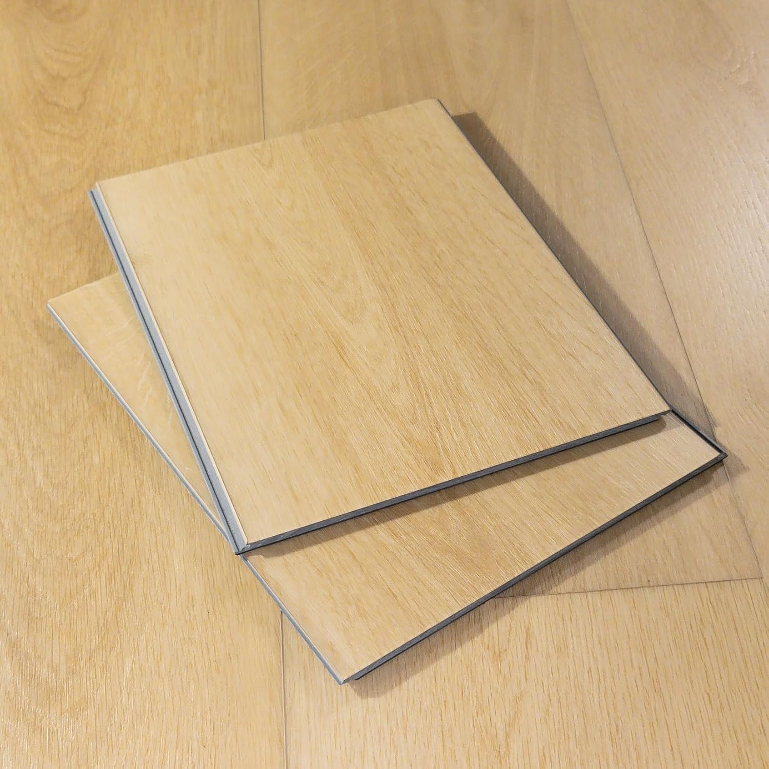
Greige Luxury Vinyl Plank
Waterproof and forgiving. The busy-family answer to espresso cabinets.
Check Greige Vinyl Plank →
pH-Neutral Hardwood Cleaner
Residue-free, so light oak stays light instead of going dull.
Check Floor Cleaner →
Felt Furniture Pads
Under every stool and chair leg. The cheapest insurance a light floor gets.
Check Felt Pads →Wall, Countertop and Backsplash Colors for Espresso Cabinets
The floor is the biggest surface after the cabinets, but the rest of the palette decides whether the room feels balanced. A simple way to build it: one dark (the cabinets), two lights (floor and counter), one accent.
Best wall colors for espresso cabinets
- Warm white or cream — the most reliable; it keeps the room bright and lets the cabinets be the feature.
- Soft beige or oatmeal — cozy and traditional; check it is a yellow-beige, not a pink-beige.
- Light warm gray or greige — modern and calm; pair with a light gray or greige floor for a tonal scheme.
- Sage or soft green-gray — the one cool color that works, because green is opposite red on the color wheel and makes espresso look richer.
- Pale blue-gray — fine as an accent wall in a bright room, tricky as the main wall color.
Countertops that suit espresso cabinets
White or cream quartz
The classic. Keeps the top half of the room light and works with every floor on this list.
Marble-look with warm gray veining
Adds movement without color. Choose veining that leans taupe rather than blue.
Butcher block in light maple
Warm and casual on an island, especially over a whitewashed or greige floor.
Light speckled granite
Beige, cream and gold speckles echo a honey or travertine floor beautifully.
Backsplash and hardware
- Backsplash: white or cream subway, a warm marble-look slab, or soft sage zellige. Keep the grout light.
- Hardware: brushed brass and warm bronze bring out espresso’s warmth. Brushed nickel is safe and modern.
- Matte black: only when the floor and walls are very light; otherwise it disappears into the doors.
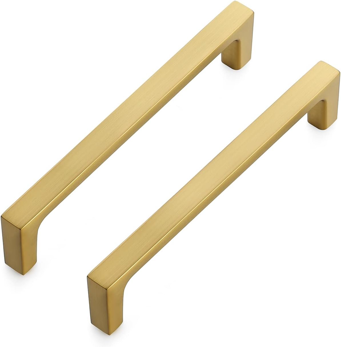
Brushed Brass Bar Pulls
The fastest way to warm up espresso doors. Swap in an afternoon.
Check Brass Pulls →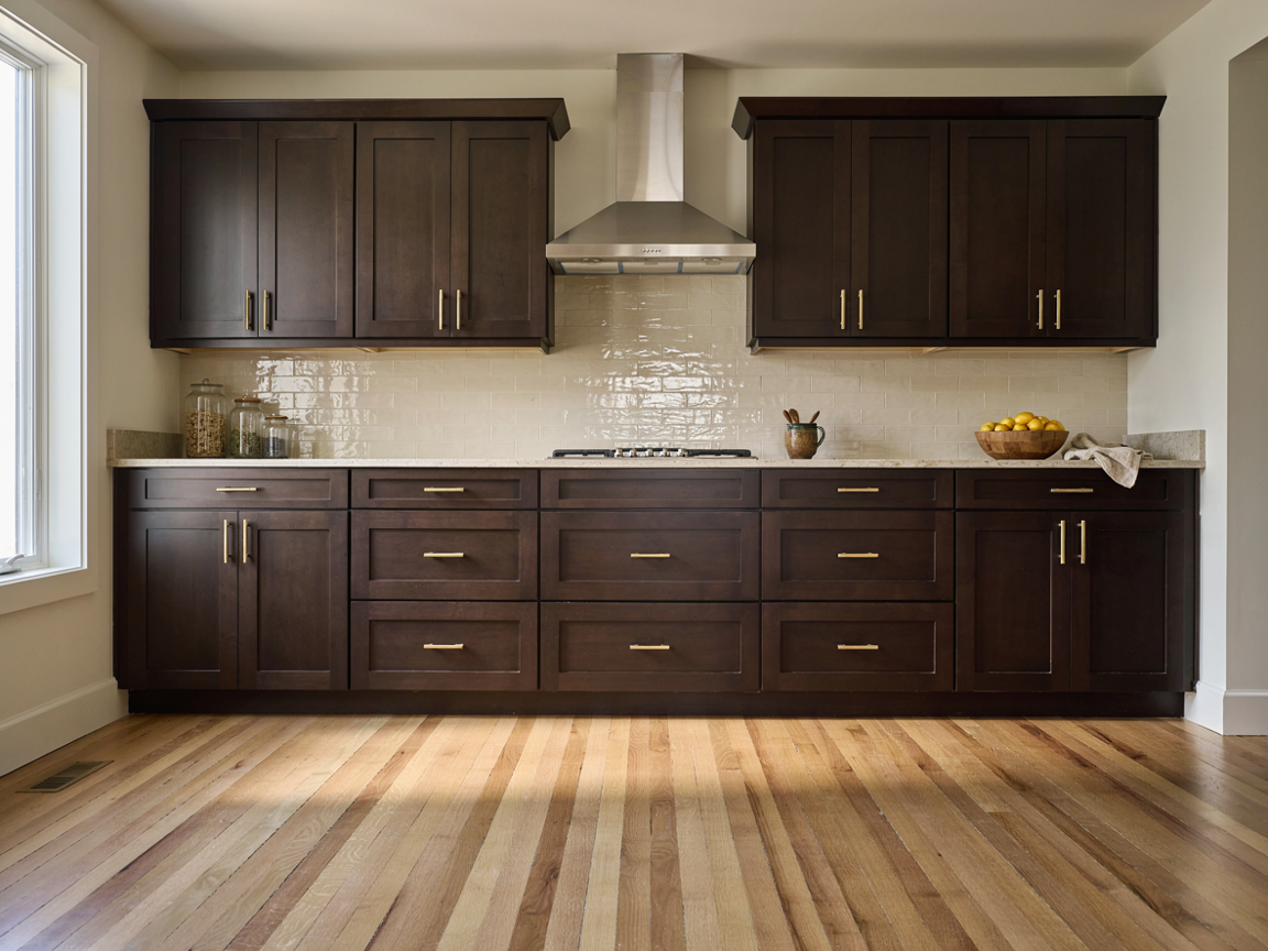
Floor Colors for Small or Dark Kitchens with Espresso Cabinets
Dark cabinets in a small kitchen are not a mistake, but the floor has to do more work. These moves keep the room feeling open.
- Go two steps lighter than you think. Whitewashed oak or cream tile, not natural oak. The smaller the room, the higher the contrast should be.
- Use wide planks or large tiles. Fewer lines on the floor read as more space.
- Run planks toward the window or the longest wall. The eye follows the lines and the room feels longer.
- Match the grout to the tile. A grid of dark grout on a light floor chops a small room into squares.
- Keep the floor matte. Gloss floors reflect the dark cabinets and make the room feel busier.
- Add under-cabinet lighting. Espresso uppers cast a shadow on the counter; lighting the counter makes the whole room feel brighter than any floor can.
- Keep walls, counter and backsplash in the same light family. The cabinets should be the only dark element.
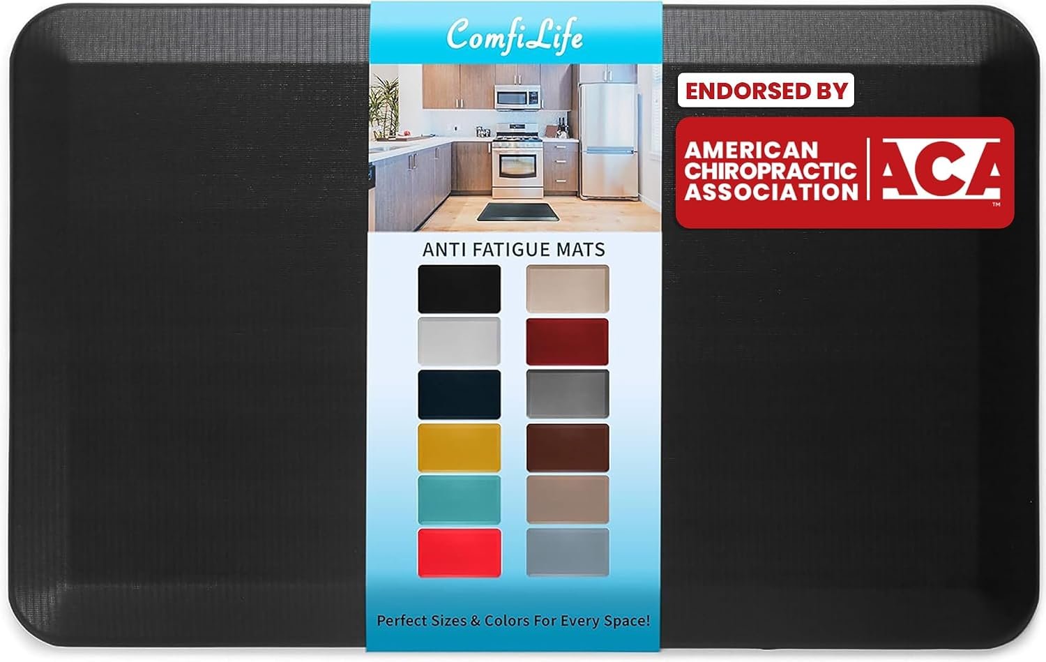
Anti-Fatigue Kitchen Mat
At the sink: protects light floors from drips and saves your feet on tile.
Check Kitchen Mat →In a small espresso kitchen, aim for roughly 60% light surfaces (floor, walls, counter, backsplash), 30% espresso (the cabinets) and 10% accent (hardware, stools, a runner). If the cabinets are creeping past 40% of what you see, lighten the floor before you repaint anything.
Floor Colors to Avoid with Espresso Cabinets
- A floor that matches the cabinets. Espresso floor plus espresso cabinets flattens the room and shows every crumb.
- Pink-beige tile or carpet. Turns salmon next to espresso’s red undertone.
- Cool blue-gray or green-gray wood. Makes the cabinets look muddy and the kitchen feel cold.
- Orange-toned cherry or red oak. Doubles espresso’s red and the kitchen goes brassy.
- High-gloss anything. Reflects the dark cabinets and looks dated fast.
- Busy patterned tile in a small room. The cabinets are already the statement; a patterned floor competes with them.
- Dark grout on light tile. Draws a grid across the floor and shrinks the room.
Espresso Cabinets and Floor Colors: FAQ
What color floor goes best with espresso cabinets?▼
Light, warm floors work best: natural white oak, whitewashed oak, honey maple, warm greige plank or creamy beige tile. They reflect light back into the room and share espresso’s warm undertone, so the dark cabinets look rich rather than heavy.
Are espresso cabinets black or brown?▼
Brown. Espresso is a very dark brown that can look black in low light, but under daylight you will see chocolate and a hint of deep red. That red undertone is why warm floors flatter it and cool grays fight it.
Should the floor be lighter or darker than espresso cabinets?▼
Lighter, in nearly every kitchen. Espresso is already near the darkest end of the scale, so a floor that is at least three shades lighter keeps the room balanced. A darker or matching floor only works in a large, bright kitchen with pale counters and walls.
Can you have dark floors with dark cabinets?▼
Yes, but only with a lot of daylight. A dark walnut floor under espresso cabinets can look luxurious in a big kitchen with tall windows, white counters and light walls. In an average or small kitchen it makes the room feel closed in. Keep the floor a few shades lighter than the cabinets and matte, and never match them exactly.
Do gray floors go with espresso cabinets?▼
Warm grays and greige do; cool blue-grays do not. A light greige or taupe-gray floor looks modern and hides dirt. A gray with blue or green in it makes espresso look muddy. Test the sample on white paper and reject anything that leaks blue or lilac.
Do wood floors have to match kitchen cabinets?▼
No, and they should not. Floors and cabinets should coordinate, not match. Aim for a clear difference in lightness and a shared undertone (warm with warm). Matching wood tones exactly makes the room look like one big block of brown.
Do dark cabinets make a kitchen look smaller?▼
They can, if everything else is dark too. Espresso cabinets with a light floor, light counters, light walls and under-cabinet lighting read as a bold feature in a bright room. The floor is the biggest lever: go whitewashed oak or cream tile in a small kitchen.
What color tile goes with espresso cabinets?▼
Cream, warm beige, travertine-look and light greige porcelain. Choose a matte or honed finish, large format, with grout that matches the tile. Avoid pink-beige and glossy black tile.
Should countertops be lighter or darker than the floor?▼
With espresso cabinets, keep both light. The cabinets supply all the dark the room needs; a light floor and a light counter sandwich them and keep the scheme balanced. A dark counter over a dark floor with dark cabinets is the “cave” combination to avoid.
Which floor color hides dirt best in an espresso kitchen?▼
Warm greige plank or a travertine-look tile with soft veining. Mid-light colors with a little variation hide crumbs, dust and pet hair far better than pure white or very dark floors, both of which show everything.
Can you put engineered hardwood in a kitchen with espresso cabinets?▼
Yes, and it is often the better choice. Engineered white oak handles kitchen humidity better than solid wood and comes prefinished in the natural and whitewashed tones that suit espresso best. Choose a thick wear layer so it can be refinished once.
What is the most popular floor color with dark brown cabinets right now?▼
Natural and whitewashed white oak, followed by warm greige vinyl plank. Light, matte, wide-plank floors dominate current espresso kitchens because they open the room up and photograph well; the very dark and very gray floors of a decade ago have faded.
The Bottom Line on Floor Colors for Espresso Cabinets
Espresso cabinets are a keeper: timeless, rich and easy to restyle. The floor decides whether they feel elegant or heavy, and the recipe is simple. Lighter than the cabinets, warm in undertone, matte in finish.
- Natural white oak if you want one choice you will never regret.
- Whitewashed oak or cream large-format tile if the kitchen is small or dark.
- Warm greige plank if the kitchen is busy and you want it to hide dirt.
- Creamy beige or travertine-look porcelain if spills and pets rule the room.
- Honey maple or terracotta if you want it cozy and traditional.
- Dark walnut only in a big, sun-filled kitchen with pale counters and walls.
Then check the undertone on white paper, keep the walls and counter light, and let the espresso cabinets be the one dark thing in the room.